Wednesday, 26 September 2018

Thai Clay flower making - Part 1 ( Material needed to make thai clay flowers )

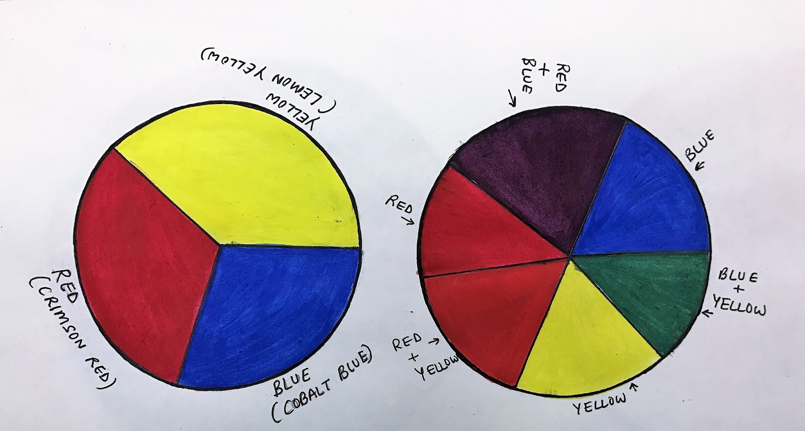
It has been a while since I have written anything for my blog . The last post was on water colours - trying to understand the medium. Very soon I will start with lessons on how to use these mediums, as a learner we face lot of challenges , on how to handle them , what are the different ways to use them to make different kinds of paintings. 

Last few days have been very busy with workshops. The latest one going on is on Thai Clay flower making . So today will share with you all how to go about making Thai Clay flowers. 

The first and foremost thing is what all material you need to make flowers using Thai Clay.


Thai Clay Flowers Arrangement


Material Needed-

1. Thai Clay

2.Tools - Ball tool (it comes in three sizes- big , medium, small ), Veining tool, Knife tool ,         Poking tool, Frilling tool , Golf tool, Square tool

3. Cutters - There are different cutters available for different flowers. The cutters come as         a set for flowers and leaves together.

4. Floral wires - The floral wires  are available in different thickness, which are used                differently for making leaves, stems and flowers. 

5. Pasta Sheets - The pasta sheets are used to roll the clay.

6. Pasta Machine or rolling pin -- Both pasta machine and rolling pin can be used to roll         the clay. It's as per our convenience. Both of them work well .  How to use them will be         explained in the upcoming  blogs  and you tube videos.

7. Colours -  Oil colours , Acrylic colours or water colours can be used to add colour to clay     depending on the brand of the clay one is using . The thai clay  manufacturers at times         have their own specifications as to what colour mediums can be added to  clay.

8. Cold cream or vaseline 

9. Craft glue / Fevicol / Super dry feviquik

10. Floral Tapes 

11. Pollens 

12. Buds 

13. Cling Wrap 


Tuesday, 15 May 2018

Basics and skills of water colors - Part 2

A few water colour facts which one should keep in mind while using water colours are ;
1. The whites that we see in water colour are actually the white of the paper.
2. The colours dries much lighter than the colour we see when they are wet.
3. The water colours dry very fast in hot and dry conditions.
4. The colors take time to dry in humid conditions.

BRUSHES;  To start with the brushes which one needs can be--

Number 5 round brush.
Number 6 round brush.
Number 8 round brush.
Number 10 round brush.
One inch flat brush.
Number 0, Number 1 round brushes for thin lines.

Best brushes are Sables. Water color sponges are used for lifting out paints and a good alternative
to brushes for laying washes. Cotton buds are also used for lifting colors. Large flat brushes are also useful for laying washes. Mop brushes are also good for washes but are expensive like sable brushes.

Paper ; There are three types of paper; rough , medium and smooth. They all are machine made and are given names from the method of production.Rough paper has no alternative name but smooth paper is known as 'hot-pressed' and medium paper as hot or sometimes as cold pressed.
Handmade papers which differ widely in texture and are not always easy to handle..
The papers are made in different weights. The thicker the paper the more it costs. This paper must be stretched first.

Monday, 30 April 2018

Basics and skills of watercolours - Part 1

There are two types of watercolor paints - Transparent and Opaque.
1. Water color paints are made from either natural pigments found in the earth ; clay, minerals, etc.or from synthetic pigments which have been finely grounded and then held together with a water soluble based 'gum'binder.
2. Water color paints are available in two forms: tube and pan.
Transparent and Opaque
A transparent water color allows the light to shine through to the water color paper and in turn lets the white of the paper reflect back. The colors look clean , crisp and appear to glow. Water colors falls into these two main categories with some being in between and described as semi transparent and semi-opaque.
Opaque colors block the light from coming through to the water color paper. Instead the light bounces off the pigment. This can make the colors appear to look dull.
Non staining and staining-
Non staining water colors will settle on the surface of water color paper after the water has evaporated. These colors once dried ,allow you to lift the pigment off the surface to reveal the white of the paper underneath.These colors mix extremely well with other non staining colors. (when new to water color begin with nonstaining then slowly introduce Staining colors into your palette.)
Staining colors will immediately absorb into the first few layers of water color paper before the water has had a chance to evaporate. These colors , once dried are difficult to lift to get back to the white of the paper and will leave a stained tint of the color. Staining colors mix extremely well with other staining colors, but when mixed with non-staining colors they have a tendency to stain the non-staining color and can dominate the overall color of the mixture.

Sunday, 11 March 2018

Understanding colour mediums-- What are oil Colours ?

Colour pigments are integral to our lives. They are all around us. Coming to paintings and artworks there are so many colour mediums available these days-- Water colours, Oil colours, Acrylic colours ,
Wax crayons, Pencil colours, Pastels, Pens, .....the list is endless..

Understanding of mediums, how they are made, how they behave on different base helps an artist a lot. There was a time when artists used to make colours on their own , but with technological and scientific advancements we have the luxury of ready to use colours.

OIL COLOURS  ;  The colour pigments are same in all. How they are bound gives them the body and types. In oil colours as the name explains itself , pigments are bound in oils and contains fillers. The fillers are used to give body to colours. There are two types of oil paints-- artist quality and less expensive ones for  students . The artist quality ones use best oils and pigments and contain more quantities of fillers. Normally filler consists of aluminium hydrate or blanc fixe. The fillers are white pigments which are used to give body to paints. The oils commonly used to bind the pigments are linseed oil, poppy oil, sunflower oils.... 

The colour pigments are derived both from natural and artificial sources. Oil colours are available in tubes, tubs and bars. These days water mixable oil paints are also available for people who are allergic to oils and solvents used in traditional oil paints .In oil colours the drying time is long, which gives us enough time to correct our  mistakes. The oil colours are very smooth and creamy.  They can be used directly from the tube , can be thickened by adding additives and can  be thinned by using thinners and various oils . Linseed oil , turpentine oils are commonly used to thin the oil colours. For people who are allergic or can't stand the odour of spirits and turpentine oil , low odour thinners are also available.

In India Camlin is one of  the most commonly used brand, but these days many international brands like Pebeo , Daler - Rowney and so many others are also available. 

Monday, 12 February 2018

Colour Theory - Part 2

There are certain terms which we come across to while painting. Having an understanding of them helps us in making colour combinations, getting a particular hue , and so on.The different terms which I am going to talk about today are hues,value,high key , low key, tints ,shades,tones,warm colours,  and cool colours .

VALUE ;- Value is the term used to describe the relative lightness or darkness of a colour  (or of black ).

HIGH KEY or LOW KEY:- A high key drawing is filled with light values and evokes an airy, carefree feeling while a low key drawing uses mostly dark values and creates a more mysterious mood.

TINTS , SHADES and TONES :-Pure colours can be tinted with white to make them lighter ,shaded with black to make them darker , or toned with grey to make them more muted.

WARM COLOURS and COOL  COLOURS :- The colours on the red side are warm . The colours on the blue side are cool.The colours with red or yellow in them appear warmer and colours with more green or blue in them appear cooler. For ex.if a normally cool colour like green has more yellow added to it , it will appear warmer and if a warm colour like red has a little more blue it will seem cooler.

Warm colours appear to come forward and cool colours appear to recede. This knowledge is valuable when creating the illusion of depth in a scene. Warm colours generally convey energy and  excitement , whereas cooler colours usually indicate peace and calm.
Complements can create a sense of tension,cool hues can evoke a sense of mystery . Light cool colours can provide a feeling of tranquility and warm colours can create a sense of danger.

Tints, Shades and Tones

Primary and Secondary Colours

Tuesday, 23 January 2018

Colour Theory - Part 1

Colours are an integral part of painting. Understanding of colours , how to get a particular colour shade is very important . The first lesson which I'll start my blog with is Colour Theory. Sharing with you all my understanding of colours and how to prepare our own colour palette .


To start with - Colours can be grouped in three segments - Primary , Secondary and Tertiary colours.

PRIMARY  COLOURS are the pure colours. They cannot be made by mixing together other colours. RED, BLUE and YELLOW are the primary colours.

SECONDARY COLOURS -   When we mix two primary colours together, three secondary colours are made;

Red      +  Yellow makes  Orange .
Yellow  +   Blue makes  Green.
Blue     +  Red makes  Violet.
The resulting hue depends on which hue of red , blue and yellow we are using as primary colour.

 TERTIARY COLOURS - We get tertiary colours also known as 'intermediate colours', by mixing together a primary colour with an equal amount of  the secondary colour next to it on colour wheel.

Red    + Orange gives Red-Orange
Yellow + Orange gives Yellow-Orange
Yellow + Green gives Yellow-Green
Blue    + Green gives Blue - Green
Blue    + Violet gives Blue - Violet
Red     + Violet  gives Red -Violet
Primary colour - Red (crimson)

Secondary Colour - Red + blue= Violet


Primary Colour -Blue (cobalt)
Secondary Colour- Blue +Yellow = Green

Primary Colour -Yellow (Lemon)
Secondary Colour - Red + Yellow= Orange


Tertiary Colour- Red + Violet
Tertiary Colour - Blue + Green 


Tertiary Colour -Red  + Orange
Tertiary Colour -  Yellow + Orange
Tertiary Colour- Blue  + Violet

Tertiary Colour- Yellow + Green


 The colours are also known as hues. The Secondary and the tertiary colours are always darker or lighter than the primary colours/hues. One can create the colour spectrum in a wheel shape , or squares or rectangles or any form which one likes, but I like more of squares and rectangles.
In the upcoming post I'll be discussing tints, shades and tones, values, warm and cool colours.


Wednesday, 17 January 2018

A New Beginning !!!

B.A (hons) in Economics, M.B.A by profession, I have always found peace in colors. Corporate job was never my cup of tea. It's in my paintings and creativity  where I find my solace !!
The ambitions inside me were always looking for a window, and my creativity got me here.
Learning, exploring colors has been an amazing journey:)

Today running my own art studio, I am enjoying my journey as an artist, as an art facilitator for my art community. 
Connecting people to their creative imaginations, is deeply gratifying.
This journey of mine from being a Mother to finding a niche for me, to create a world of my own is self-rewarding.

Like they say "I am ME that is my power."

Setting up my foot in this world of blogging is going to be transforming for me. Starting up  my own blog to share my understanding and experiences of colors, mediums, painting styles and techniques, and different arts and crafts
🎨🎨😊😊

Stay tuned to be a part of this artistic journey.....

"Your Limitation- It's Only Your Imagination." I firmly believe in this....


Tips for drawing

Hi there, As in my previous lesson I have mentioned about the materials needed for sketching/drawing, now before we get to drawing / sketch...